

Leading the redesign of State Farm’s Community Offers experience to address low engagement, unclear value, and misaligned product direction
State Farm’s Community Offers platform was designed to connect customers with curated discounts and rewards. Despite significant investment, the experience struggled with low engagement, unclear value, and usability challenges.
As UX Lead, I was brought in to diagnose the underlying issues and lead a redesign effort to simplify the experience, clarify the value proposition, and create a more scalable foundation for growth.
As UX Lead, I drove the redesign effort across web and mobile app experiences.
My responsibilities included:
I worked at the intersection of user needs, business goals, and product strategy.
Client:
StateFarm
Engagement Type:
End-to-end redesign strategy and execution
Role:
UX Lead/Senior UX Architect
Collaboration:
UX, Product, Engineering
Platform:
Desktop/mobile responsive, mobile app
The platform faced several critical issues limiting its effectiveness:
From a business perspective, this resulted in:
This was not simply a usability issue—it was a product direction problem.
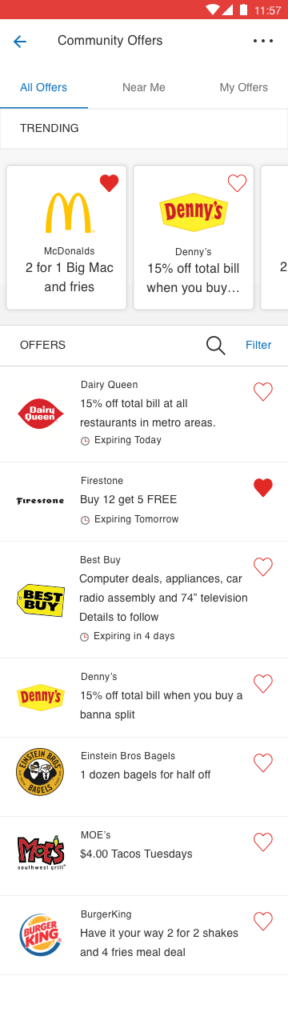
Old design
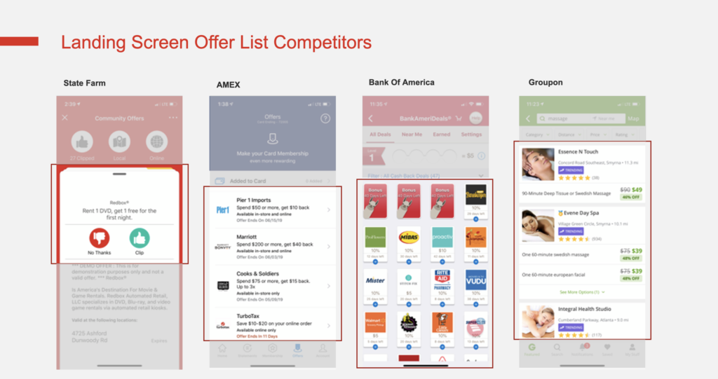
Discovery and Diagnosis
I led a focused discovery effort to understand where the experience was breaking down.
This included:
The platform was not failing due to lack of features—it was failing due to lack of clarity and usability.
Users struggled to:
Additionally, early AI-driven features added complexity without improving the experience, increasing cognitive load and user confusion.
Based on these findings, I helped redefine the product direction around three core principles:
Clarity Over Complexity
Simplify the experience and reduce unnecessary elements
Guided Experiences Over Open Exploration
Help users move toward meaningful actions with clearer pathways
Value-First Design
Surface relevant offers and benefits early to reinforce usefulness
This represented a shift from a feature-heavy experience to a user-centered, goal-driven product.
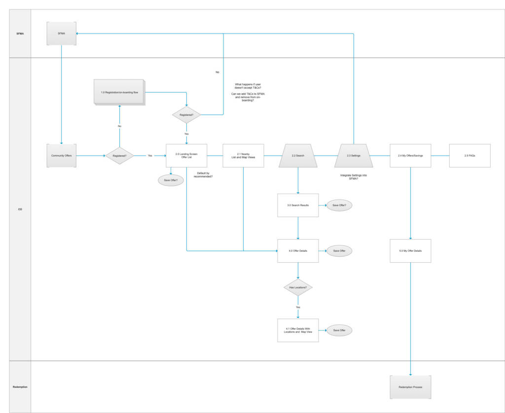
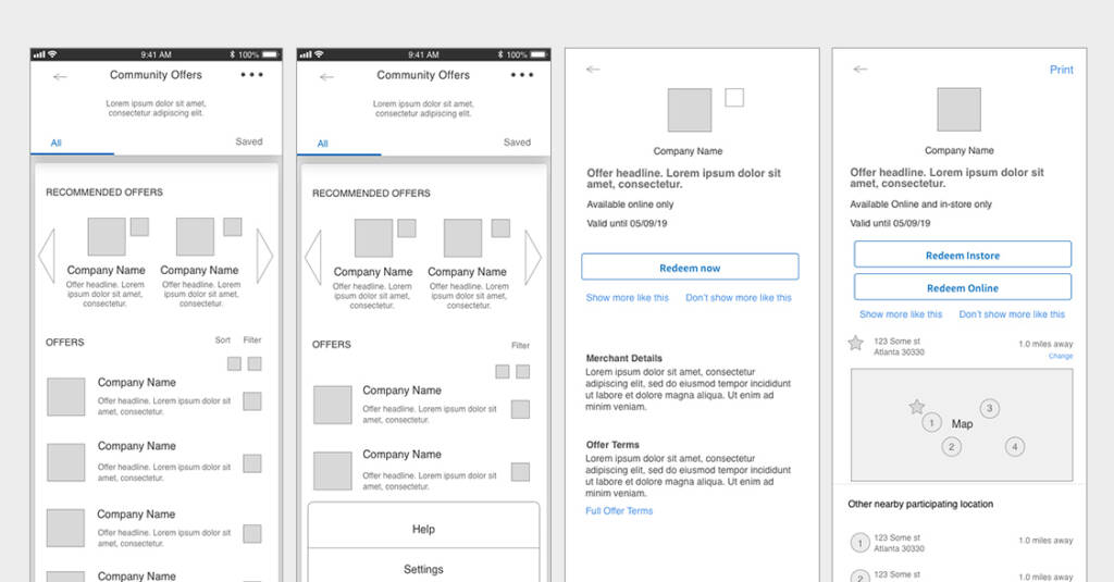
I led the redesign of key user flows and interaction patterns to address core friction points.
Key Improvements
New design
While specific production metrics were limited, the redesign delivered meaningful strategic impact:
Most importantly:
The platform shifted from a confusing, feature-heavy experience to a focused, user-centered product with a clear direction.
Before
After
This work reflects my ability to:
More features do not create better products—clarity and usability do.
By simplifying the experience and focusing on user needs, the platform was repositioned for stronger engagement and long-term success.