Skip to content Skip to footer
case studies

Redesigning a High-Traffic Account Management Experience to Improve Usability and Reduce Support Calls

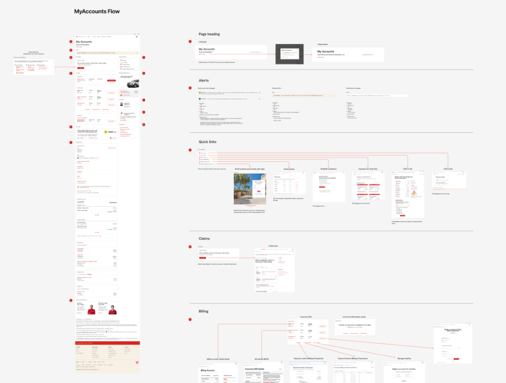
Leading a year-long UX-driven transformation of State Farm’s My Accounts platform

my accounts redesign

Project Overview

State Farm’s My Accounts platform is a critical, high-traffic experience where customers manage policies, billing, and service requests.

Given its importance, friction in the experience directly impacts:

  • customer satisfaction
  • operational efficiency
  • call center volume


My Contributions

I led UX efforts across a year-long redesign initiative in close collaboration with Product and Engineering. The goal was to improve usability, simplify the experience, and introduce scalable enhancements—without disrupting the existing product roadmap.

Client:
StateFarm

Scope:
End-to-end redesign strategy and execution

Role:
UX Lead/Senior UX Architect

Collaboration:
UX, Product, Engineering

Platform:
Desktop/mobile responsive (authenticated)

The Challenge

The experience had recently been updated, but usability challenges remained:

  • Users struggled to find key information and complete tasks efficiently
  • Navigation and information architecture created confusion
  • Content lacked clarity and context
  • Redundant elements increased cognitive load

At the same time, constraints were significant:

  • The platform was already live and widely used
  • A full overhaul risked disrupting business operations
  • Product teams needed to stay aligned with an active roadmap

The challenge was to drive meaningful improvements within real-world constraints, balancing user needs with business continuity.

My Role

I led UX strategy and execution across the redesign, working closely with Product and Engineering teams.

My responsibilities included:

  • Leading UX assessment and identifying root usability issues
  • Driving alignment across cross-functional stakeholders
  • Defining redesign priorities and strategic direction
  • Facilitating collaborative working sessions
  • Designing and refining updated user flows and interfaces
  • Ensuring solutions aligned with both user needs and business constraints

This required both hands-on design leadership and strong cross-functional influence.

Approach

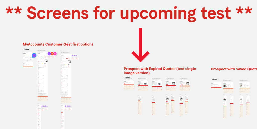
I structured the work as a continuous, iterative effort aligned with the product roadmap.

  1. UX Assessment and Discovery
  • Conducted heuristic evaluations and journey analysis
  • Identified friction points in navigation, content, and task flows
  • Synthesized stakeholder and business input
  1. Problem Framing and Alignment
  • Translated findings into clear, actionable themes
  • Framed issues in terms of both user and business impact
  • Built alignment across Product and Engineering teams
  1. Incremental Redesign Strategy

Rather than a full overhaul, I defined a phased approach:

  • Prioritize high-impact usability improvements
  • Deliver updates iteratively
  • Align changes with roadmap timelines
  1. Design and Optimization
  • Simplified layouts and reduced clutter
  • Restructured information architecture
  • Improved navigation and task access
  • Introduced more flexible, scalable design patterns

Key Insights

  1. Findability Was a Core Barrier

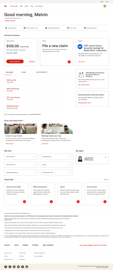
Users struggled to locate important information due to unclear structure and organization.

Impact: Slower task completion and increased frustration

  1. Cognitive Load Was Too High

Cluttered layouts and redundant elements made the experience harder to navigate.

Impact: Reduced usability and lower efficiency

  1. Task Access Was Not Intuitive

Key actions were not easily accessible or clearly prioritized.

Impact: Users took longer paths or required assistance

  1. The Experience Lacked Flexibility

The existing system limited the ability to personalize and evolve the experience.

Impact: Reduced long-term scalability and relevance

Design Strategy

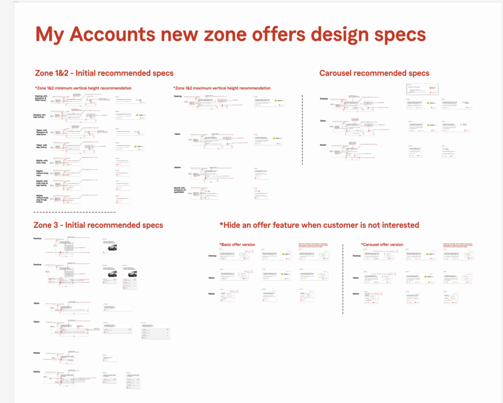
Based on these insights, I led a redesign focused on:

Simplifying the Experience

  • Removed unnecessary elements and reduced clutter
  • Streamlined layouts to improve clarity

Improving Information Architecture

  • Reorganized content to better match user expectations
  • Improved grouping and labeling

Enhancing Task Accessibility

  • Made key actions easier to find and complete
  • Reduced steps in common workflows

Enabling Personalization and Flexibility

  • Introduced a more dynamic and scalable structure
  • Supported future personalization and feature expansion

Solution

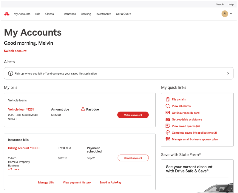
The redesigned experience delivered a cleaner, more intuitive platform:

  • Simplified layout and structure
  • Reduced redundancy across the experience
  • Clearer navigation and improved task access
  • More flexible infrastructure to support personalization
  • Improved alignment between user expectations and system behavior

Outcome

The redesign delivered measurable and strategic impact:

  • 10% reduction in related call center volume
  • Improved usability and task efficiency
  • Strong positive feedback from leadership
  • Successful delivery without disrupting the product roadmap
  • Established a more scalable foundation for future enhancements

What This Project Demonstrates

This work reflects my ability to:

  • Lead UX strategy on complex, high-traffic platforms
  • Drive alignment across Product, Engineering, and stakeholders
  • Balance user needs with business and technical constraints
  • Deliver measurable business impact through design
  • Create scalable, future-ready experience frameworks